 I really don’t mind being patient with Google+ site errors, but I really would prefer an accurate error message to being given a list of all the things it *could* be.
But let’s talk about our own websites, and how they could work better when errors pop up. You should ensure that your users are given a direct path to fixing whatever just happened. And for bonus points, consider providing users a simple, clickable path to recommended resolutions so that they spend as little time as possible dealing with these kinds of unfortunate interruptions when they do happen. In my case with Google+ just a few moments ago, if I were given an error message that properly reflected the problem that I was encountering, I may have been able to resolve things myself and keep on keepin’ on.
Instead, this is what happened:
- I was reading a good WordPress blog post and decided I’d +1 it. (Still sounds weird … but so did “like” at first.)
- I clicked on the +1 button, and was shown a little red box with an exclamation point. No indicator of what happened, and mousing over it still did not give me an error message.
- I clicked on it again and got a popup to their help docs with a variety of reasons for why the error could occur. Still don’t know what happened so I can take the next step to fix it.
- I blogged about what happened.
- I “liked” the blog post I was reading using the Facebook widget just to the right of the +1 🙂
And while this was a small, inconsequential issue that I enountered (I wasn’t submitting a resume or banking online, or anything like that), I think it’s a good reminder for designers and developers to give users a graceful experience when their websites get the hiccups. I understand that it’s often the last thing on your project’s to-do list, and might be your clients’ lowest priority, but be careful that proper error handling doesn’t fall of the radar completely.
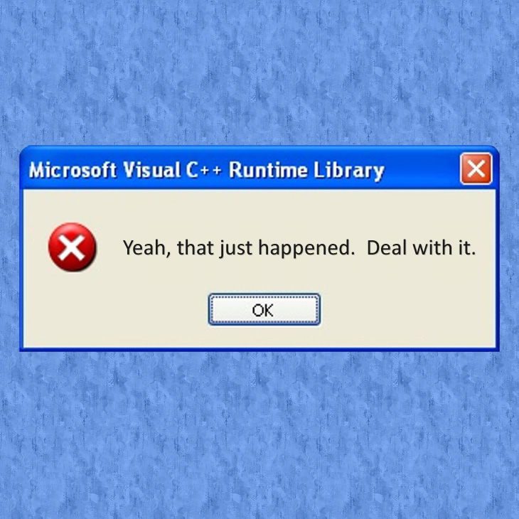
Think about the web sites you’ve used yourself, and how your experience when that site encountered errors compares to what you expected it to be. And while you should remember that form always follows function, consider spending some extra time making your error handling a little more charming and funny! I’m a huge fan of funny 404 pages (this is a personal favorite), and you could certainly create a similar experience when your users hit a snag anywhere else on your site.
Contextual help and obvious resolutions make all the difference to a user when they encounter an error within your application, and getting those people back on track quickly will directly affect the successful adoption of your website!